
Source of inspiration: Mar/Apr 2018 issue of Cloth Paper Scissors, “A Secret Rose Garden” by Laly Mille
I chose this because I loved the soft, delicate spray of roses created by Laly Mille in this project (you can see the original in the third image on this page). The subtle layers that gave depth and detail, the marks suggesting rather than describing, the colours ranging from pastel to vivid shades. She works in a way that is very much my style; instinctive, serendipitous, building up or covering over where necessary and aiming for a certain feel rather than strict representation. Of course, I had to do things a little differently, but I still followed quite a lot of the process and learned some great techniques in doing so.
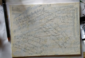 For the background, I used large torn pieces of sheet music, currently my favourite collage material. I painted over with white and buff acrylic and journalled in pencil. My inspiration for this piece was not spring, but an early autumn visit to an open garden in the New Forest, Patrick’s Patch, where I had taken photographs of the varied and colourful flowers (see below). The journalling was of the happy memories of that visit, focusing on the sensory impressions and feelings as I recalled them.


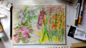 Although on the one hand a limited colour palette is usually easier to turn into a cohesive piece, I really wanted the variety that I had captured in the photos and so decided to take a risk. I chose a number of colours, and different marks to show flower stems as well as foliage. As per the instructions, I scribbled in water-soluble medium and went over it with some gloss gel medium applied with my finger. First I tried watercolour sticks, but they did not spread as easily as I wanted. I then tried Distress Crayons, which spread very well, but I didn’t have the range of colours I wanted. Finally I used oil pastel. This worked surprisingly well, and gave me 25 colours to go at, including four shades of green.
 I skipped the step of adding magazine images of flowers, as I had a hunch it wouldn’t work so well with my composition. I did however use a few of the paint techniques, though in my case keeping them all to a pale background colour as a way of tying together the different shades. This included finger-painting, drips down the canvas in very watered-down acrylic, and paint splatters. On a whim, I added some blue sky to make the piece more reminiscent of the day I was trying to recreate.
Finally, I skipped the brayering step and instead did the opposite – added to the contrast with some scribbles in black and white gel pen.
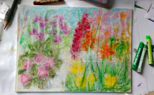
I ended up with a very different piece! As intended it is more vibrant and varied, replacing the soft wistfulness of spring rose petals with a riot of colour and bright sunshine. I love that you can see all the layers; the occasional musical note and snatches of journalling among the petals. The complexity invites the viewer to keep looking.

Leave a comment